An infographic, “use[s] visual cues to communicate information” (Page 20). Simply put, it tells a story about information. People have been using graphics as a representation of information for centuries; this includes cave paintings (Page 14). Today, many businesses are using infographics to grab their target market’s attention. “About 65% of people are mainly visual learners” and “90% of information transmitted to the brain is visual”.
In order to effectively communicate through an infographic you need to appeal to your audience, they need to be able to comprehend your message, and they should retain the information (Page 30). If done correctly, “infographics can make your content more understandable”.
Visually, a good infographic follows three rules: utility, soundness, and beauty (Page 198). Utility is measured by how it enables a brand to reach its objectives. Was the audience able to retain the message? Soundness is whether the infographic is communicating something meaningful. If the audience doesn’t care about the message, what’s the point? Beauty is the actual look of the infographic. The design needs to be visually pleasing but still represent the information in an appropriate manner. It should not skew or misrepresent the information (Page 201).
How do you determine if it is a good infographic? You need to look at: color, type, composition, and concept.
Color:
There should be a consist theme with the color. It should follow some type of color scheme: complementary, split-complementary, monochromatic, etc. The colors should also match the idea of the infographic. You wouldn’t use bright neon colors in an infographic about dogs. They visually do not go together.
Type:
Type is also important. There should not be six different types, all different sizes, in one infographic. You should, however, follow a couple type rules. There should be type hierarchy, meaning some type should purposely stick out (for example the title). This also falls into the two changes rule. When writing something with a heading, followed by a body paragraph, there should be a noticeable difference. Perhaps make the headings bold and in red and make the body paragraph regular and in black. This visually shows the hierarchy; the heading is meant to be important.
Composition:
An infographic should be visually pleasing. Information should be neatly organized, so the audience can easily flow through the information. The best way to organize information is by using a grid. It’s helpful to layout where the information should go ahead of time.
Concept:
Overall, how is the infographic? Do the color, type, and composition harmoniously work together? If the information is difficult to understand because of the visual itself, then the infographic is not successful.
By learning how to properly create an infographic, a company can make its content more understandable, thereby, grabbing its audience’s attention and increase brand awareness.
To learn more about infographics, check out Justin Seeley's tutorials on Lynda.com or purchase The Power of Visual Storytelling by Jason Lankow.
For better reference, I have written critiques for the following two infographics.
 | 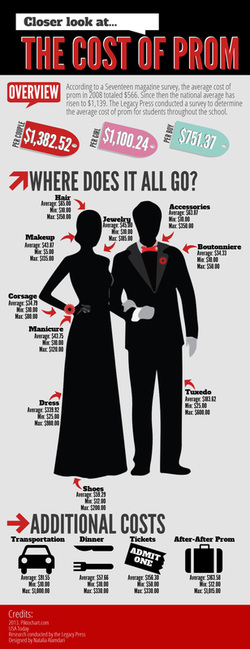 |
| I thought this was a well done infographic. The colors work really well together and complement each other. The graphics are clean and easy to understand. There is a good flow and this person definitely used a grid to arrange their work. I also like the type choice and the mix of slab-serif and sans-serif. The slab-serif really pops because it is used scarcely. The sans-serif was a good choice for the body paragraphs because it is simple and easy to read. However, I wish the type in the body paragraphs was larger. Also, this artist used different type for the headers. “The Scary Truth” used the slab-serif but the “Tips for a Safer Trip” used the sans-serif. They should have both been slab-serif. I thought the overall concept for FIDO was good. The images and text worked well together. I liked the playfulness, using the dog tags for the headers. The graphics were simple but powerful. All the dogs looked similar and everything had a rounded edge to it. Nothing seemed out-of-place. This was a creative way to provide helpful information to people who travel with their pets. | I did not particularly like this infographic. It was a little dark and drab for prom, which should be a happy experience. The price tags used fun colors but they didn’t go with the overall look. They seemed out of place. The subheadings (like Hair, Makeup, etc.) should have been a different color from the body paragraphs, to follow the two changes rule. The layout makes the infographic look unbalanced. There is a lot of text on the left side, which makes the right side look empty. I liked the graphics throughout. The bottom graphics were simple but impactful; I understood what they were representing. I also liked the price tags at the top (minus the colors); they went with the “cost” theme. The boy and girl were okay. I don’t like the girl graphic as much. The boy’s tux is outlined well but the girl is all black. They could have outlined her dress more and given her better hair. They should have also shown her shoes and jewelry because there is an arrow pointing to those areas on her. I thought the Prom concept was okay. It was interesting to see what the money goes towards on prom night. However, it could have been better. There isn't much information other than the min, max, and average. It would have been nice to have some extra details. |
Sources:
- Infographics: The Power of Visual Storytelling by Jason Lankow, Josh Ritchie, and Ross Crooks
- http://digitalmarketingphilippines.com/10-reasons-why-you-should-use-infographics-in-your-content-marketing-efforts/
- http://inspiredm.com/why-infographics-are-so-important-to-your-content-marketing-strategy/
- http://primeinfographics.com/65-of-all-people-are-visual-learners/
- https://www.google.com/search?rlz=1C1KMZB_enUS566US566&espv=2&biw=1242&bih=606&tbm=isch&sa=1&q=infographic+about+dogs&oq=infographic+about+dogs&gs_l=img.3..0.155689.156041.0.156185.4.4.0.0.0.0.70.253.4.4.0.ccynfh...0...1.1.64.img..0.4.252.I0Ha1h7QEmA#imgrc=uughf2Fl2JYjZM%3A
- https://www.google.com/search?q=infographic+about+prom&rlz=1C1KMZB_enUS566US566&espv=2&source=lnms&tbm=isch&sa=X&ved=0CAcQ_AUoAWoVChMI7PD61aW4yAIVARk-Ch3dwAQV&biw=1242&bih=606#imgrc=cuBH-6rgvMwiNM
 RSS Feed
